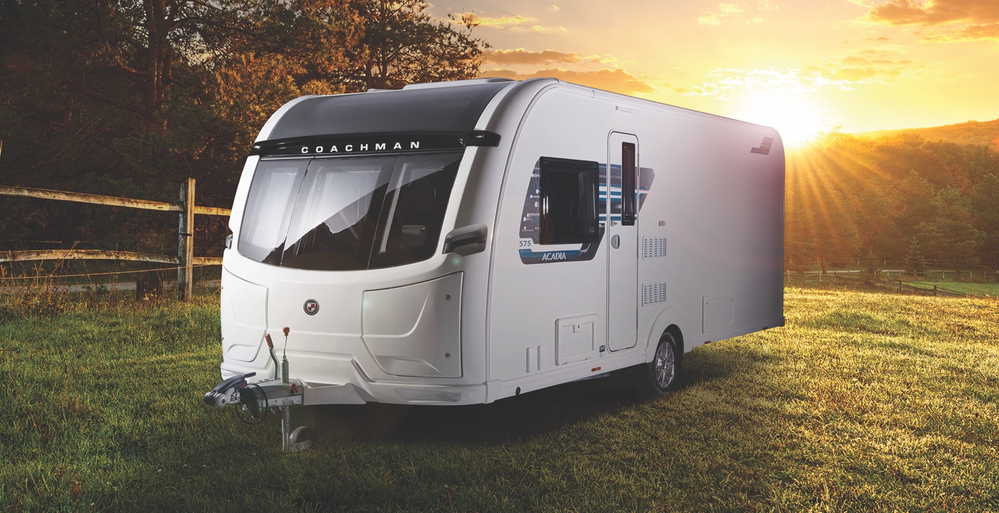


12 months ago, Coachman Caravans embarked on an exciting project to return to the roots of the company while simultaneously pushing forward into a new era of caravanning – choosing to entirely rebrand Coachman Caravans.
Elliot Hibbs, Managing Director at Coachman Caravans, said, “We have merged the past, present and future to form a new, stronger brand identity. This new logo represents the same great quality and exceptional standards as the caravanning industry expects from Coachman, but with a refined, clean and more inviting look.”
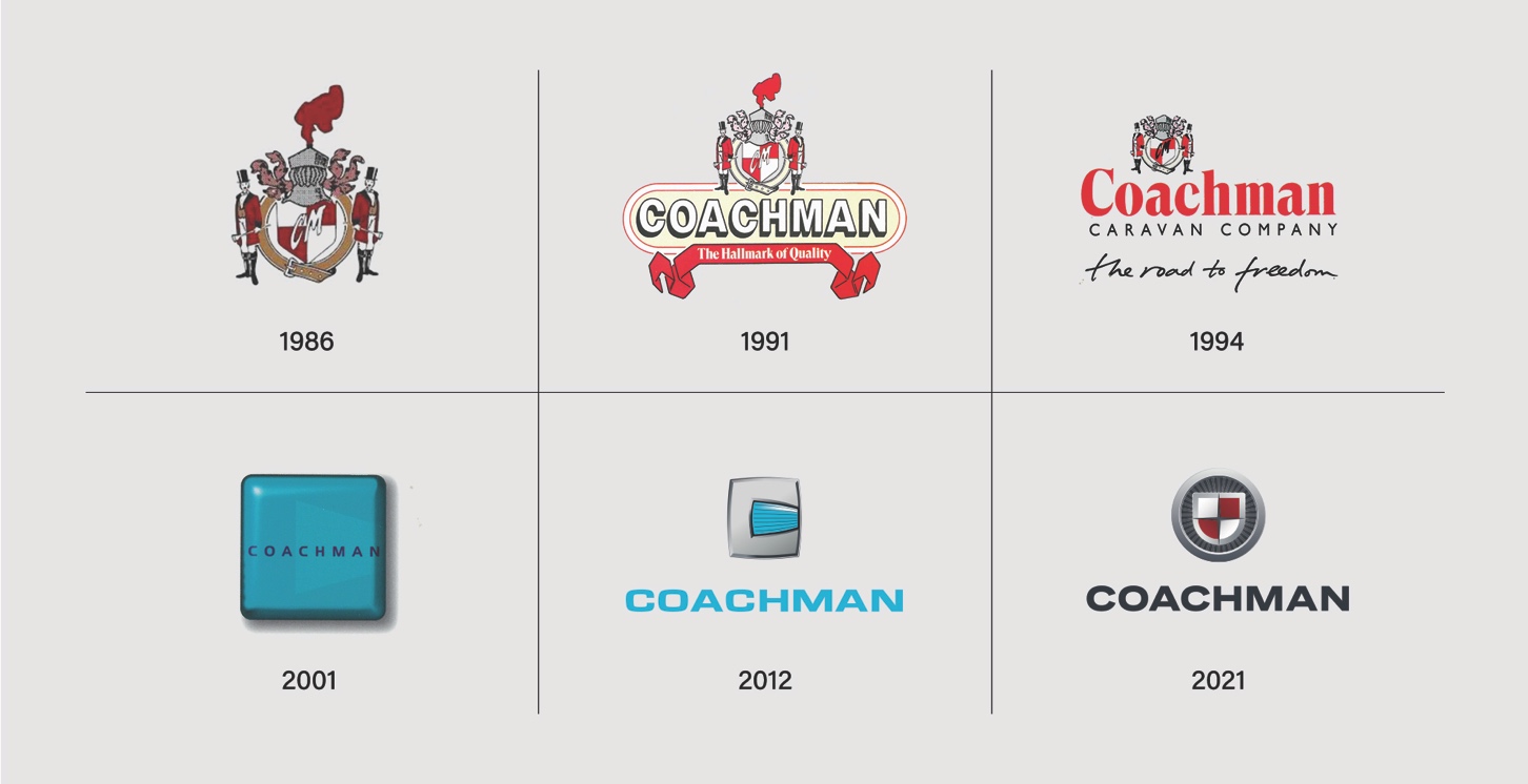
Elliot has paid tribute to his late father and previous Coachman Caravans owner, Jim Hibbs, by incorporating elements of the original Coachman logo. The combination of the new temperate colour scheme and the history of Coachman signifies the company’s drive to move forward and strive for even higher quality, while still maintaining the original values of exceptional service and superior products that the brand has become synonymous with.
What’s more, you’ll now see Coachman’s slogan – The Road to Freedom – across all of its material.
This phrase was originally used by the company in 1994 when under ownership of the late Jim Hibbs, and is still a firm aim of the company today.
Not only does this slogan represent all that the company stands for in offering families the opportunity to go on holiday when they want – and where they want – in comfort, but also reflects what we all wish for, as the nation begins to safely move out of lockdown following the Coronavirus pandemic.
Expertise as standard
Coachman worked in partnership with Kal Group, the UK’s leading leisure marketing agency, to create the new brand.
Kal Group boldly chose to move away from the existing ice-blue colour and instead introduced a sumptuous, carmine-red tone, which is more representational of the brand’s warming welcome to both new and existing customers alike.
Martyn Seiles, Creative Director at Kal Group, said, “We wanted to embrace the spirit of Coachman, so part of the research process involved looking into the brand’s history to reinterpret its heritage.
“Our drive was to emulate what Coachman represents within the industry and to its customers – an approachable and dynamic brand with heart – while also capturing the essence of the founding Coachman logo from 1986.
“It has been a privilege to help fuse the company’s history and the future together within this new logo. This change is more than a badge on a premium caravan: it represents a proud father/son story, which honours the achievements of past while taking the company forward into the future,” concluded Martyn.
Looking to the future
Elliot further commented, “I am excited to finally be able to unveil the new Coachman logo to all our customers. I feel that now is the time to move into the next era of the Coachman brand; we have created a new icon that will stand the test of time, just like the products we produce.
“I would like to reassure customers that, while we have rebranded, this change is a truer representation of our company’s existing ethics and core beliefs of high-quality products and exceptional aftercare service, all of which are continuing to improve as we push for even higher-quality services.”
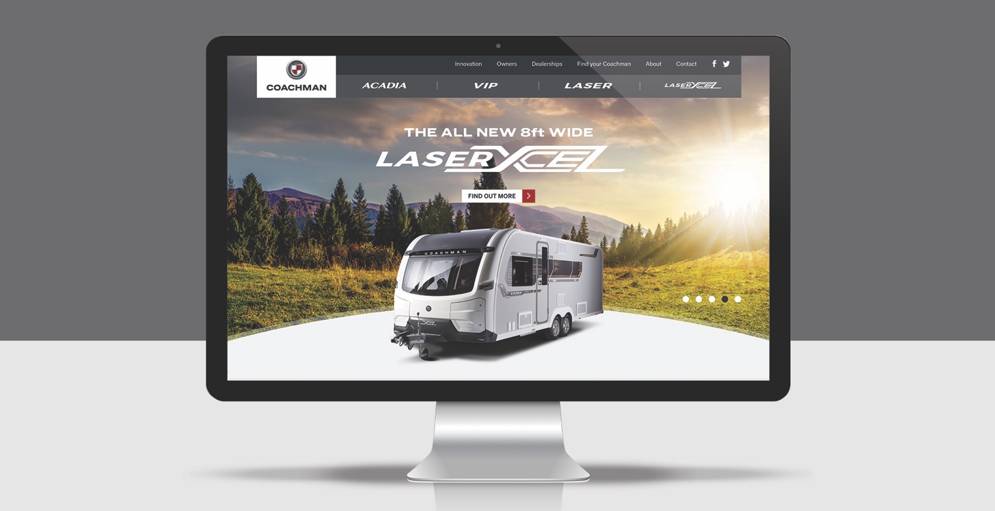
The rebranding of Coachman will be introduced onto the website in August and then across all other material throughout 2020, with 2021-season products being the first to receive the new badge.
Coachman has merged the past, present and future to form a new, stronger brand identity